 Contact us
CLIENT WORK / AUTOMOTIVE
Car Pro
Repair.
A confident digital presence for independent auto repair. A complete design system, from the workshop-led opening to service discovery and the first inquiry.
Visit the live website ↗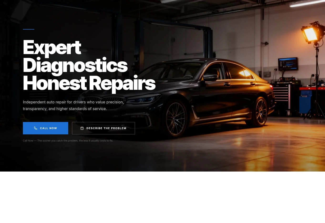
THE PROJECT
Precision in the workshop.
Clarity on the screen.
A website shaped around the questions people bring to an auto repair business. The design combines a recognizable visual identity with an organized service collection, diagnostic guidance and a simple route to contact.
- CLIENT
- Car Pro Repair · Fletcher, North Carolina
- DESIGN SCOPE
- Homepage, services, diagnostic experience and contact
- EXPERIENCE
- Desktop & mobile · Live page exploration
ART DIRECTION
Automotive.
Without the noise.
Strong typography, a controlled blue accent and workshop photography establish confidence. Light content sections give practical information room to breathe. The contrast between atmosphere and clarity carries through the entire site.
TYPOGRAPHIC DIRECTION
Expert diagnostics.Honest repairs.Bold display lettering. Clear supporting copy. A direct next step.
01 / FIRST IMPRESSION
Confidence, from the first screen.
The opening puts the workshop and the vehicle in view. A dark overlay gives the headline room without losing the atmosphere. Blue identifies the primary action; an outlined secondary action offers another way to begin.
The design connects a bold introduction with practical next steps: call the shop or describe the problem. Explore the complete homepage to see how this opening flows into services, trust and repair stories.
Loading the live design…
02 / SERVICE DISCOVERY
A collection you can understand.
Each service gets an image, a consistent card and a route to more detail. White surfaces change the pace after the cinematic opening, keeping a broad service offer easy to browse.
The services page carries the same identity into a different composition. The introduction establishes the scope; the collection helps people find the relevant repair.
Loading the live design…
03 / SERVICE PAGE DESIGN
Start with the driver’s question.
A warning light or unfamiliar noise is often the beginning of the journey. The diagnostic page pairs a specific introduction with recognizable symptoms, workshop imagery and a clear next action.
The homepage diagnostic section and the dedicated service page work together. They use the same visual language while giving the service more space to explain itself.
Loading the live design…
04 / THE FINAL INTERACTION
Make the next step feel straightforward.
A service request has to connect the driver, vehicle and problem. The contact page brings the practical details and form into the same composition, with a restrained black-and-white treatment.
On desktop, contact information and fields share the page. The mobile preview lets you inspect the narrower layout and its reading order, from the contact details to the request fields.
Loading the live design…
ONE CONNECTED DESIGN SYSTEM
Every page has a job.
Every detail belongs.
From the first impression to an inquiry, the same visual language keeps the experience connected. The case shows the actual website, with supporting design details you can open and inspect.
Explore Car Pro Repair ↗NEXT PROJECT
Font 42 · The marketer’s website ↗YOUR NEXT CHAPTER
STARTS WITH A CONVERSATIONyour mark.
Tell us where you are today.
And where you want to go.