 Contact us
SELF-INITIATED / PERSONAL BRAND
Font 42.
A personal presence.
The original website for Bohdan Tkachenko as an independent marketing and design specialist. A complete visual identity across the homepage, service collection, individual service pages and inquiry experience.
ORIGINAL WEBSITE / DESIGN ARCHIVE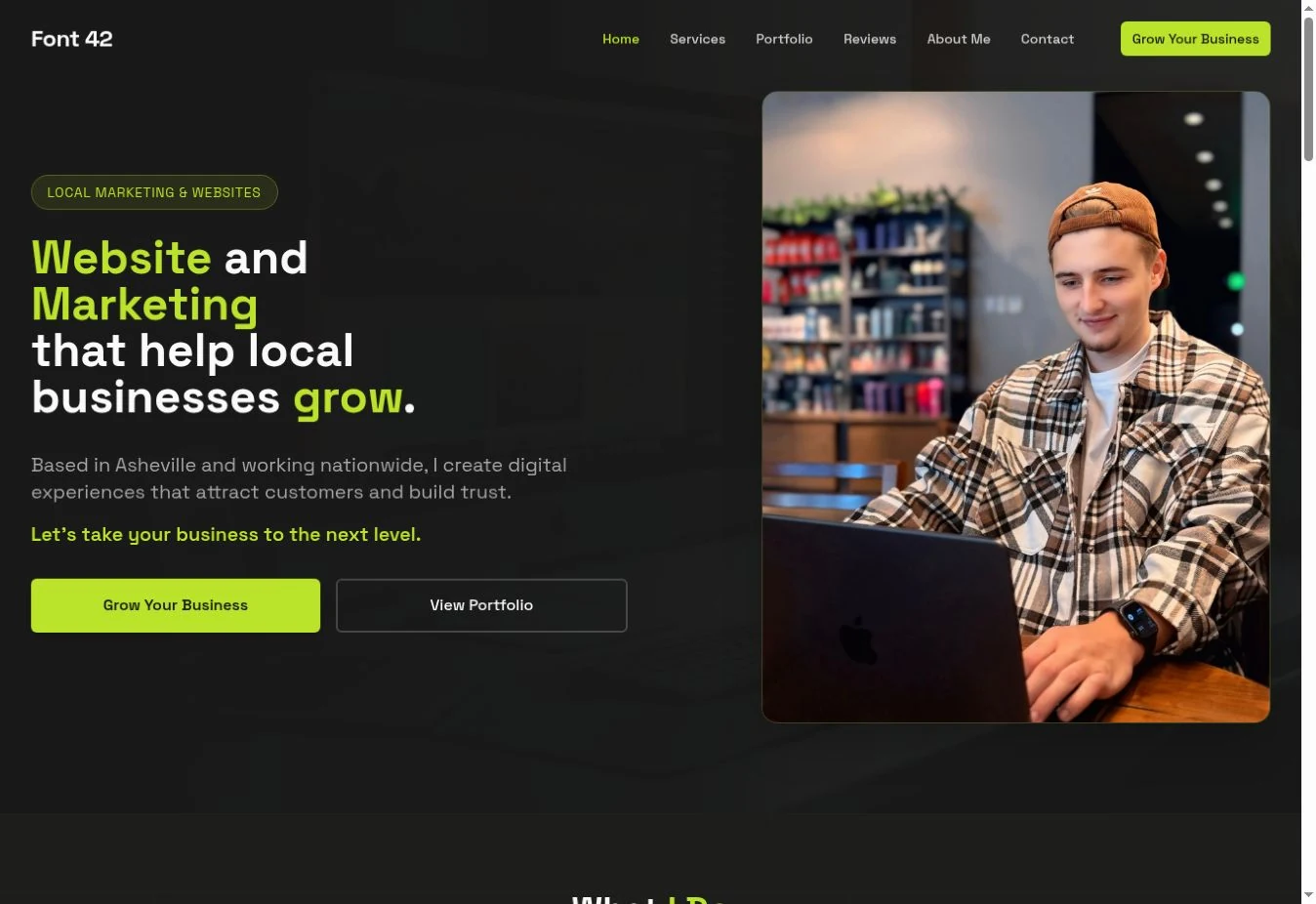
THE ORIGINAL DIRECTION
A business website.
With a person behind it.
This version of Font 42 was designed around a specialist. It connects a personal introduction with a structured offer, an illustrated service collection and dedicated pages that explain each discipline.
- PROJECT TYPE
- Our own personal-brand website
- DESIGN SCOPE
- Homepage, service collection, service pages, cards and contact
- EXPERIENCE
- Preserved design archive · Expandable details
ART DIRECTION
Dark foundations.
A visible point of emphasis.
Lime connects the headlines, controls and small details. The dark surface holds the visual system together, while service photography and illustrated cards introduce variety within the same identity.
TYPOGRAPHIC DIRECTION
Website.Marketing.
Growth.A direct display voice. Consistent emphasis. Readable supporting information.
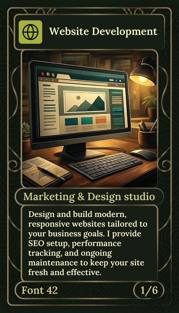
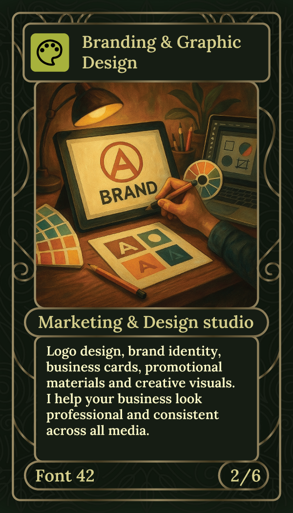
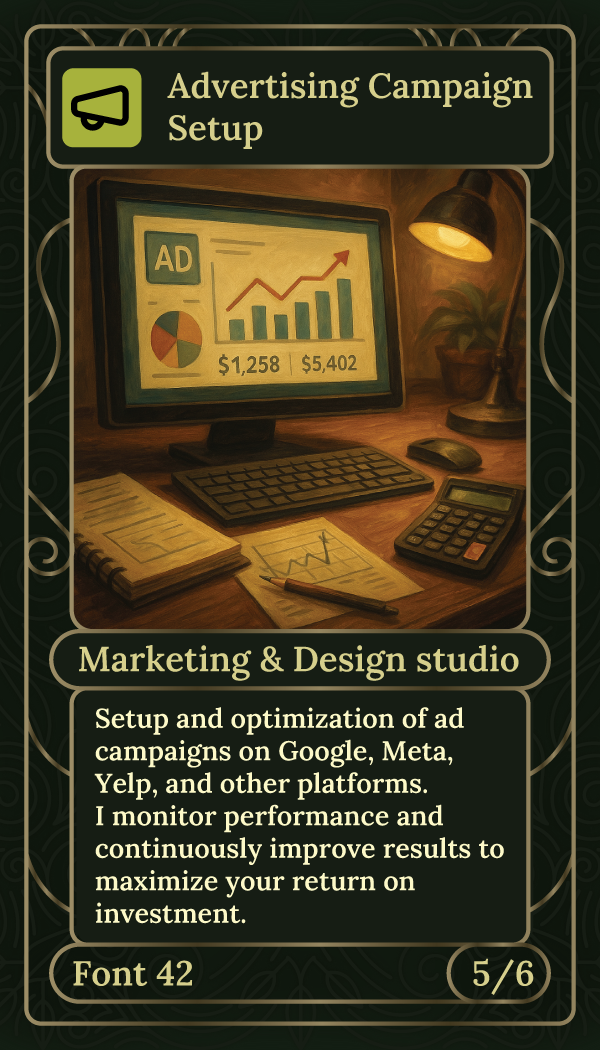
01 / ILLUSTRATED SERVICE CARDS
Different disciplines. One visual family.
Web design, branding and advertising become a recognizable collection. An ornamental frame, numbered series and warm imagery give each service its own character while holding the set together.
02 / WEB DESIGN & DEVELOPMENT
A focused opening for a specific service.
A workspace photograph sets the context. A direct headline, short list of capabilities and lime action establish the offer without competing for attention.
03 / BRANDING & ADVERTISING
Same identity. Different stories.
The page system adapts to the subject. Branding emphasizes the visual identity; advertising introduces campaign performance. Shared typography, spacing and color make the family recognizable.
04 / CONTACT & INQUIRY
Bring the conversation within reach.
Business details and a project form close the journey. The restrained layout keeps the practical information easy to find and gives the inquiry its own space.
THE COMPLETE EXPERIENCE
Recognizable across
every page.
A personal introduction, a distinctive service collection and a consistent page system. This case preserves the original Font 42 website as a full design project.
NEXT PROJECT
Rampify ↗YOUR NEXT CHAPTER
STARTS WITH A CONVERSATIONyour mark.
Tell us where you are today.
And where you want to go.