 Contact us
WEB STRATEGY · DESIGN · DEVELOPMENT
Blue Ridge
Carpenters.
A photography-led website for architectural woodworking. Designed to make the craftsmanship visible, the company understandable and the next step clear.
Visit the live website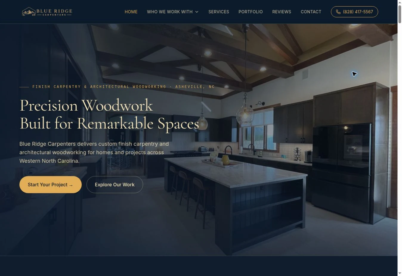
THE PROJECT
A digital home
for remarkable work.
Blue Ridge Carpenters works across custom residential interiors, finish carpentry and architectural woodworking. We developed a complete website that brings the breadth of that work into one coherent experience.
This case focuses on the design: how photography, typography, color and page structure work together—from the first impression to the smallest interaction.
- Client
- Blue Ridge Carpenters
- Our role
- Strategy, UX, copywriting,
web design & development - Experience
- Responsive desktop & mobile
- Scope
- Audience, service, project
and inquiry pages
ART DIRECTION
Architectural.
Warm. Precise.
Deep navy grounds the interface. Brass adds warmth and emphasis. Light surfaces create breathing room between image-rich sections. Editorial serif headings sit alongside straightforward sans-serif body text, balancing character with clarity.
Precision
Woodwork.
Let the work
lead the introduction.
The homepage opens inside a finished interior, not with a generic construction image. The navy overlay creates contrast without hiding the room; brass typography echoes the warmth of the wood.
Navigation stays quiet, the value proposition stays clear and two distinct actions let visitors either begin a conversation or explore the work. The composition adapts to a narrower screen rather than simply shrinking the desktop layout.
DESIGN BEYOND THE HERO
A rhythm of images,
space and detail.
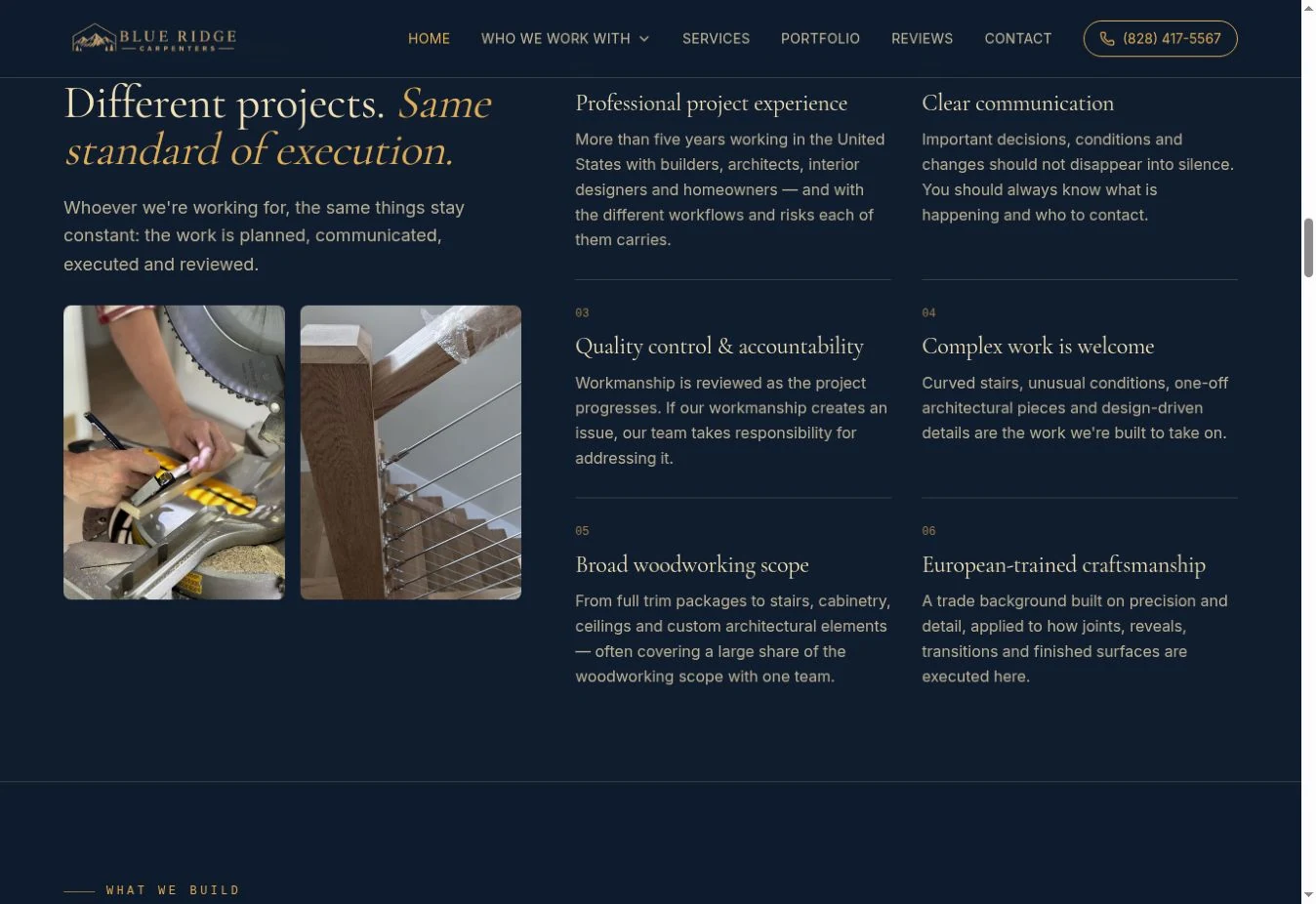
Alternating surfaces give the long homepage a clear pace. Image-led sections establish the work; quieter layouts explain communication, coordination and accountability. Numbered details, thin rules and deliberate spacing keep the system connected.
A different conversation for every client.
A homeowner, a builder and an architect do not approach the same project with the same questions. Four dedicated pages keep the visual identity consistent while changing the message, evidence and priorities for each audience.
The homeowner page combines an architectural first impression with reassuring language, a clear process and real examples. On smaller screens, the story becomes a direct, single-column journey.
Loading the live design…
The details deserve their own space.
Each service page is designed around the work itself: a strong opening, the practical questions behind the decision, an image gallery and related services. The hierarchy makes a detailed scope feel considered rather than overwhelming.
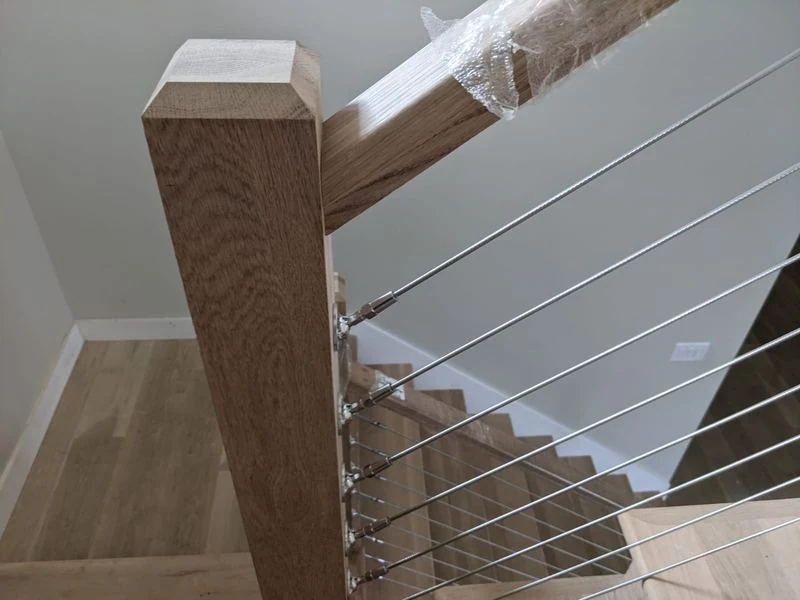
Custom staircases show how this system works. Large images establish the level of craftsmanship; supporting copy explains the scope. Mobile layouts keep the images prominent and the next step within easy reach.
Loading the live design…
Show the whole space. Then get closer.
The portfolio gives completed work the room it needs. Wide views explain the architecture; close-ups reveal the joints, materials and finish. Project context connects the photographs into a story rather than a disconnected gallery.
The Navodita interior brings multiple woodworking disciplines together in one project. Its case page uses scale, image rhythm and concise captions to guide the eye from the overall space to individual details.
Loading the live design…
A conversation that feels easy to start.
The final section pairs a simple invitation with a structured project form. Labels, spacing and field order make the request easy to understand, while optional details stay out of the way until needed.
On desktop, the introduction and form share the page. On mobile, they stack into a focused sequence with comfortable controls. The same navy and brass treatment makes this practical step feel like part of the design—not an attachment to it.
Loading the live design…
THE CLIENT’S PERSPECTIVE
In Alex’s
own words.
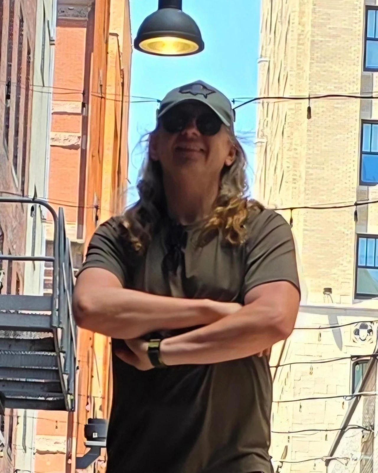
We’ve been working with Bohdan for quite some time, and it’s been a real process of finding the right marketing strategy for a very competitive and challenging market.
Over time, we developed a clear direction, positioning, and philosophy for our company, and the results are showing. Our website, blueridgecarpenters.com, has recently been completely upgraded and has become a strong representation of who we are and the level of work we provide. Clients regularly mention that the website is easy to use and that they can find us easily — one client even told us he found Blue Ridge Carpenters through ChatGPT, which was especially interesting.
Bohdan also manages and develops our social media presence, helping everything work together as one brand.
We still have ambitious plans ahead and I’m looking forward to continuing our work together. I would absolutely recommend Bohdan to other business owners and wish him continued growth, great clients, and success with his business.
ONE CONNECTED DESIGN SYSTEM
Considered at every scale.
Not just a strong homepage: a consistent language across the entire website, with layouts shaped for the way people read, browse and act on each screen.
Explore Blue Ridge CarpentersYOUR NEXT CHAPTER
STARTS WITH A CONVERSATIONyour mark.
Tell us where you are today.
And where you want to go.